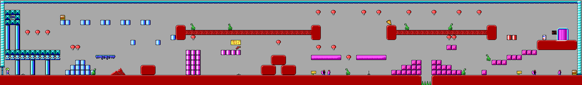
I really love this level. Not only is it a great introduction for all the reasons that Xky pointed out, but also for its overall structure.
Some nice things that jump out:
- Two different routes to the exit. Well, one and a half at least.
- Option of backtracking to collect extra points, but not necessary to complete the level.
- Non-lethal challenges offering bonus points (which also help teach jumping skills).
The Pepsi can at the end is as good as unavoidable, though, resulting in some points that are not representative of a player's skill or initiative (unless playing in point-avoidance mode).
Xky wrote:It's important to point out that there is never a stretch of ground along the bottom of the level that the player can walk for an entire screen's length and not see some sort of background tile--a red mountain, grey mountain, landmark, or Pat-Pat. This helps give a feeling of progress.
Wow, that is a good point that I'd not noticed before, and ties in with my favourite level design topic: progression. Though I've mostly been thinking of it in terms of functional coherence, in which level components tie together to tell a story. Considering it from an aesthetic perspective has me thinking about how to use this better.
Xky wrote:If I had to come up with one negative thing about this level, it would be the lack of landmarks/detail tiles along the two stretches of red ornamented platforms at the top of the level.
I think it would make it seem too mechanical to do that. Empty space can be as powerful as throwing in a background. Though, those platforms kind of count as decoration, don't they?
I wonder... is there any pattern to where background details show up throughout the rest of the levels?