Page 4 of 5
Posted: Sun Jun 27, 2010 9:17 pm
by Deltamatic
I still can't see the map image because it's on Imageshack... could someone host it on a different website that isn't Photobucket or Deviantart? I'd appreciate it.
Posted: Mon Jun 28, 2010 12:40 am
by lemm
Posted: Sat Jul 03, 2010 1:10 am
by Deltamatic
Looks great! The geography makes sense.
I noticed the dark forest is at the end of a path and not blocking anything. But you still need the firefly to get into it, so it can't be a level you can ignore. I thought a necessary item should be in it so Keen would need the firefly. The goggles?
Posted: Sat Jul 03, 2010 2:27 am
by lemm
Yeah the goggles are going to be either there or in the tree town.
Posted: Sat Jul 03, 2010 11:58 pm
by Deltamatic
Ah, I didn't remember that the forest path was dark, as well. That makes sense.
Posted: Sat Sep 18, 2010 11:20 pm
by lemm


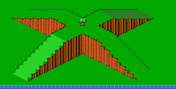
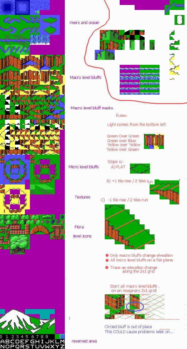
This is built using lass' tiles. I added a couple connecty bits to get the iso-perspective and rearranged the tileset since there was need for a new .tls anyways.
Notes:
dark cyan is sky texture
green is ground texture (light/dark green are due to lighting)
yellow is canyon texture
blue is water
purple is empty space
edit 1:
Topographical stuff is 90% done. I hope I've got all the masks in place. Lass has provided the Green texture, so that will be the next thing to go in.
Needed:
CANYON/BADLANDS/DIRT TEXTURE. This will be pasted over the YELLOW areas. (The texture does not HAVE to be yellow; it should probably be browny orangish or something like that) Also, it should be shaded so that there is a light, a medium, and a dark version (analagous to the grass).
LEVEL ICONS
Need level entry points, preferably drawn in the isometric perspective. We also need more junk to throw on the map; slug and lick forts, walls, rocks, houses, swamp stuff, whatever you would find in a boothill, etc.
Misc:
Rivers: I iso-fied lass's rivers, although a couple of the sloped ones look shoddy. She wants them to remain crossable; will have to play with blocking.
Posted: Sun Sep 19, 2010 6:48 am
by doomjedi
Second picture doesn't show...
Posted: Sun Sep 19, 2010 1:23 pm
by lemm
New picture; try now.
Micro bluffs still look funny to me... I think the 45 degree slope should be changed to less diagonal... will play with that too.
Perspective of that pillar might be more fitting for a level than the world map... perhaps we could move ti to arch tileset?
Posted: Sun Sep 19, 2010 5:29 pm
by doomjedi
lemm wrote:
CANYON/BADLANDS/DIRT TEXTURE. This will be pasted over the YELLOW areas. (The texture does not HAVE to be yellow; it should probably be browny orangish or something like that) Also, it should be shaded so that there is a light, a medium, and a dark version (analagous to the grass).
Some ideas:

Posted: Mon Sep 20, 2010 4:19 am
by CommanderSpleen
Too dithery for Keen, imko. Take a look at the
Keen 4 map. The ground is all very basic, using no more than two colours. That's more the style I have in mind, maybe with some extra scattered details like the
Keen 6 map.
However, if we can manage to adapt something like the style demonstrated
here into the 16-colour world (but brighter, maybe more like
this), more complicated graphics may be viable.
Aside from any judgement of Keenishness, I like the look of the desert, but the grass has far too much contrast. The green-on-green near the top-right looks the best.
Posted: Mon Sep 20, 2010 5:24 am
by lemm

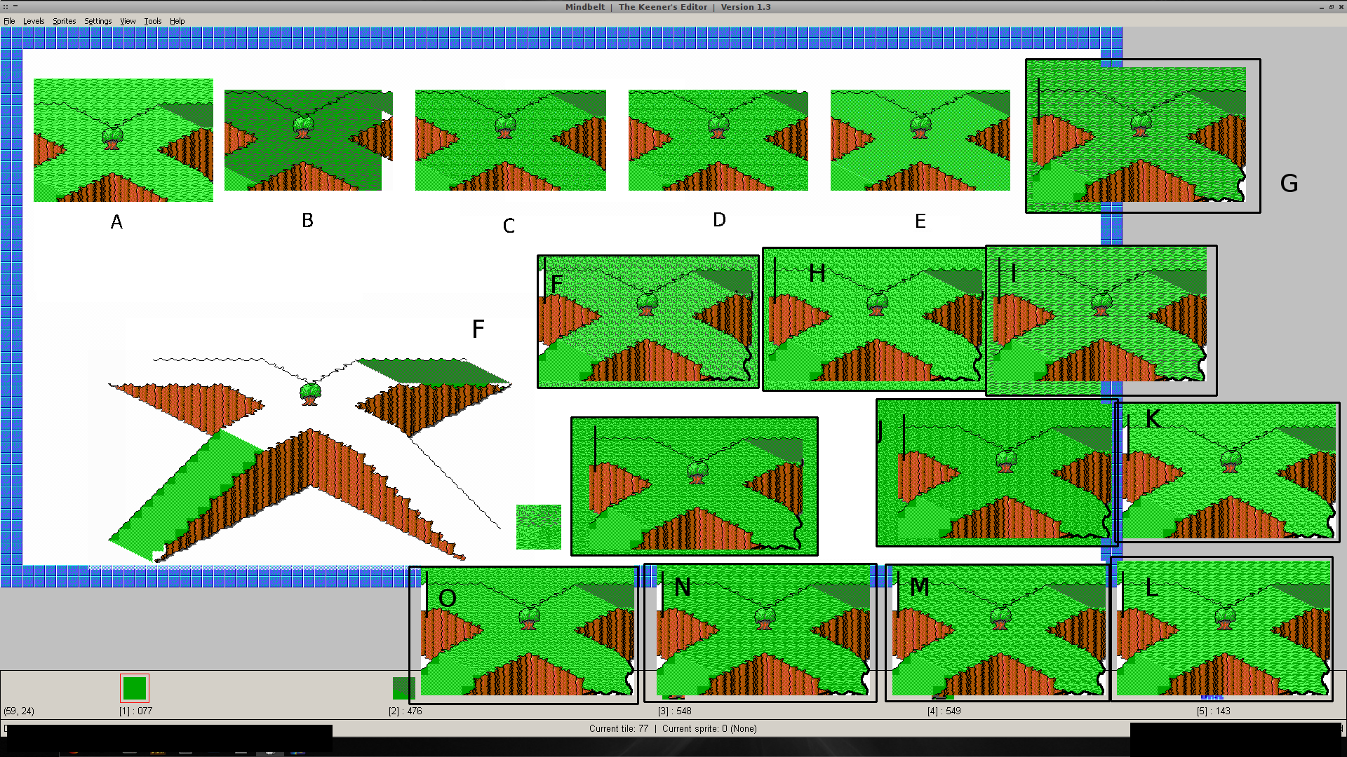
More sample textures, created by mixing lass (sample E) and doomjedi's tiles, with colour inversions. Most of them didn't turn out too well...
Posted: Mon Sep 20, 2010 6:49 am
by doomjedi
Ok, I'll see what I can do.
I'm not an expert in tiles, and especially not at making Keen tiles, but I'm slowly learning, please be patient with me :)
Damn, what I so like about you guys - is that you can take a "penni-worth" peace of art (or amination or sprite....), and make a "100 dolllar bill-worth" result from it :)
I actually like at least third (if not half) of your variations, but I'll try to make more to choose from, taking your feedback into an account.
P.S. it was a bit of misunderstanding here - but "below the line" in my spritesheet - tiles that were made for "inside the level tile" - for swamp-type levels.
Posted: Mon Sep 20, 2010 6:52 am
by CommanderSpleen
If only we had one more green.
This game gets away with three greens and turns out really nice.
I was thinking about this mod's hybrid Vorticons-Galaxy nature, and in that light more complex textures are certainly suitable. Already the ones we've got are looking more interesting than the ground tiles on the Keen 1 map.
D in the series above looks excellent. In theory, it should look monotonous, but the horizontal band of highlighting gives it a nice ripply effect, and reminds me of those shiny mowed lawns in Theme Park and RollerCoaster Tycoon.
Posted: Mon Sep 20, 2010 8:33 am
by doomjedi
Yes, D looks good, but without the grey pixel. It's probably the best variation so far.
Posted: Mon Sep 20, 2010 9:53 am
by lemm
how about D for main texture, C for light texture, and C with light/dark green swapped for dark texture? (might also shear C to align it with the slopes...)
anyways, startin the map now, since stuff is in place. Will be 180 wide by 90 tall (16,200 tiles :0). Breaking it into 9 chunks of 60x30.
